Exploratory Data Analysis with Time Series
Knowledge gain through data collection and data evaluation over time
by Dominik Falkner, MSc
Data science makes it possible to extract useful knowledge from data. Data is as diverse as people. Not only are they different in form – such as nominal, ordinal or cardinal – in order to derive knowledge from them, it is essential for many data to be recorded over a period of time. Therefore, data are often measured over a time course and so-called time series are created. A time series consists of a series of data points, which are sorted by a timestamp (e.g. of the form 1.1.2021 11:00:01). Time series can be found in a wide variety of industries, whether in industry (derived from manufacturing processes), medicine (ECGs), or the financial market (stock prices). Often time series are a central point for decision making, but bring some challenges for data analysis. The following article uses examples to show how exploratory data analysis can be designed with time series.
Table of contents
- Data Science: Brave New World
- Time Series Exploration: What Catches the Eye Directly
- Expert-in-the-loop: Collaboration is the most important thing
- Conclusion
- Author

Data Science: Brave New World
Data Science is a science that has been established for decades, but for many companies it is still new, as they are only now recognizing a benefit for themselves from it. The hype surrounding this topic in recent years caused many industrial and commercial companies to introduce Data Science without established approaches. This led to a lot of data without annotations and the knowledge about it being scattered among selected experts. The biggest challenge is to know how data is generated, how systems react and how to interpret the data. This knowledge is distributed among both data scientists and experts in the application area and must first be brought together through intensive collaboration. The success of data science projects therefore depends heavily on the cooperation of the various knowledge carriers.

Time Series Exploration: What Catches the Eye Directly
Humans have a very good and fast visual perception, which allows them to understand relationships more quickly by looking at images than by reading raw numbers and texts. Visualizations are excellent for helping experts gain a comprehensive overview of complex data. Diagrams serve as a critical tool for explaining data properties. The pitfall, however, is that while well-designed visualizations are enormously helpful, naive attempts can often be misleading and quickly prove ineffective.
However, before the implementation of visualizations can begin, another aspect is crucial for time series: the so-called sampling rate. The sampling rate specifies how often the analog signal is sampled over the measurement period and therefore determines how precisely the process is observed. It is already determined when values are collected. It is usually specified by the subject matter experts, since the sampling rate is difficult to determine without prior knowledge. The sampling rate also influences the recording time and the data size: a very high sampling rate can lead to immense memory consumption, which makes both processing and data storage more difficult. If analyses already show useful results, it may make sense to reduce the sampling rate, thus saving memory and speeding up computations. For further processing by algorithms, it is furthermore often assumed that the sampling rate is the same between time series.

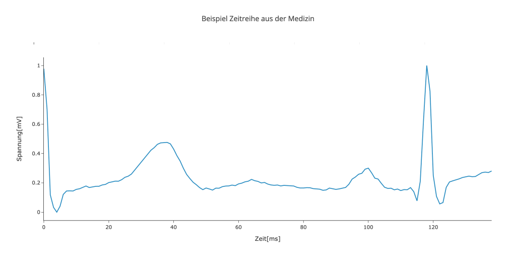
Figure 1: Example time series from the medical field showing a derivative of the electrocardiogram.

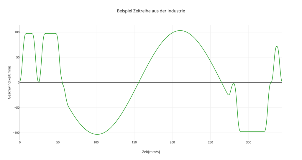
Figure 2: Example time series from industry showing the speed at which a machine moves.

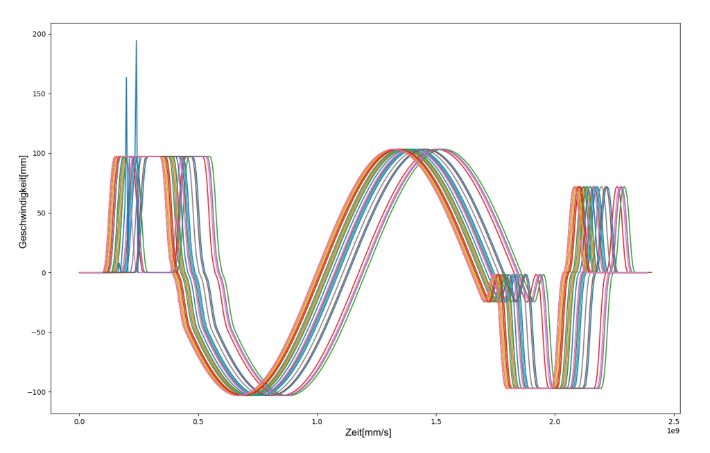
Figure 3: Superimposed line chart of several time series, which often serves as a starting point for initial analyses and provides a good overview.
As can be seen in figures 1 and 2, there are different types of time series. The first graph shows a derivative of an electrocardiogram (ECG), which is used as a basis for defibrillators to decide whether to send an electrical impulse or not. The second graphic shows physical values extracted from a manufacturing process. Both processes occur repeatedly and can therefore be compared. Often these processes are also recorded continuously, resulting in a long combined time series. In this case, this must first be broken down into individual sequences, which are then superimposed.At this point, exploratory data analysis can be used to search for patterns and commonalities in the sequences without much effort. It is usually necessary to visualize the time series. The simplest form for this is the overlaid line chart, an example of which is shown in Figure 3. This representation allows several time series to be compared quickly and helps to maintain an overview. Depending on how many time series are displayed at the same time, it may be useful to highlight interesting data points (e.g.: the newest time series or those with special characteristics).
Another possibility is to filter the data itself. Often there are environmental parameters that influence the process, such as outdoor temperature. This makes it easier to identify patterns. These visualizations are used by both data scientists and domain experts. The goal here is close collaboration between domain experts and data scientists so that as many insights as possible can be drawn from the data.
Expert-in-the-loop: Collaboration is the most important thing
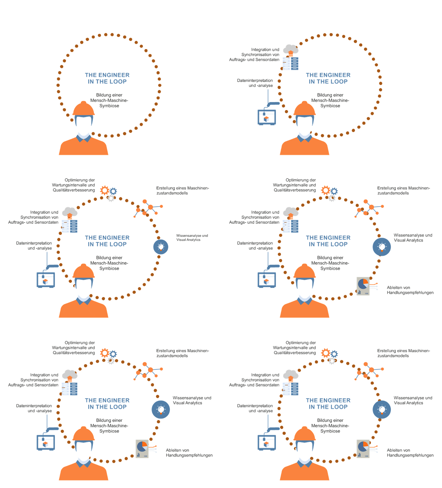
Algorithms alone cannot gain insights from data – it is even more difficult if the data is not annotated. Even experts often cannot solve problems on their own. The missing link between the two worlds is the concept of „expert-in-the-loop“. This combines the information found by the algorithm and the knowledge and experience that experts have gathered over many years. The main idea is to improve or control the results of an algorithm. The results can then be used to enrich the analyses. The new information helps experts to find patterns and can show correlations that were previously difficult or impossible to see. In addition, experts can provide feedback on what the algorithm recognizes well and what it does not. On this basis, the algorithm can be adapted.
Another way to support subject matter experts in exploring data is to make the usability of the interface as interactive as possible. If the visualization of the data is only static and the experts cannot interact with it, the possibilities for visual acquisition are very limited. If, on the other hand, it is possible to influence the display options, the perspectives expand and with them the chance to find connections. The integration of domain knowledge works best if the data can be visualized in a way that can be interpreted by experts. On the one hand, it is necessary to create visualizations that express the different properties of the data, and on the other hand, there must be an interface that is easy to understand and allows domain knowledge to be incorporated.

Conclusion
Time series analysis is an excellent way to gain insights from data over time. Visualization in particular supports people in recognizing correlations and patterns. This is especially important so that subject matter experts can enrich the data with their domain knowledge and thus generate a great deal of added value from the data through their active participation in the data science process.
Another way to compare time series is time series clustering. This represents a method to automatically search data for patterns. Read more about this in one of our next technical papers.
Contact
Author
Dominik Falkner, MSc
Data Scientist


